|
|
Post by Mouthwash on Feb 15, 2017 0:29:15 GMT
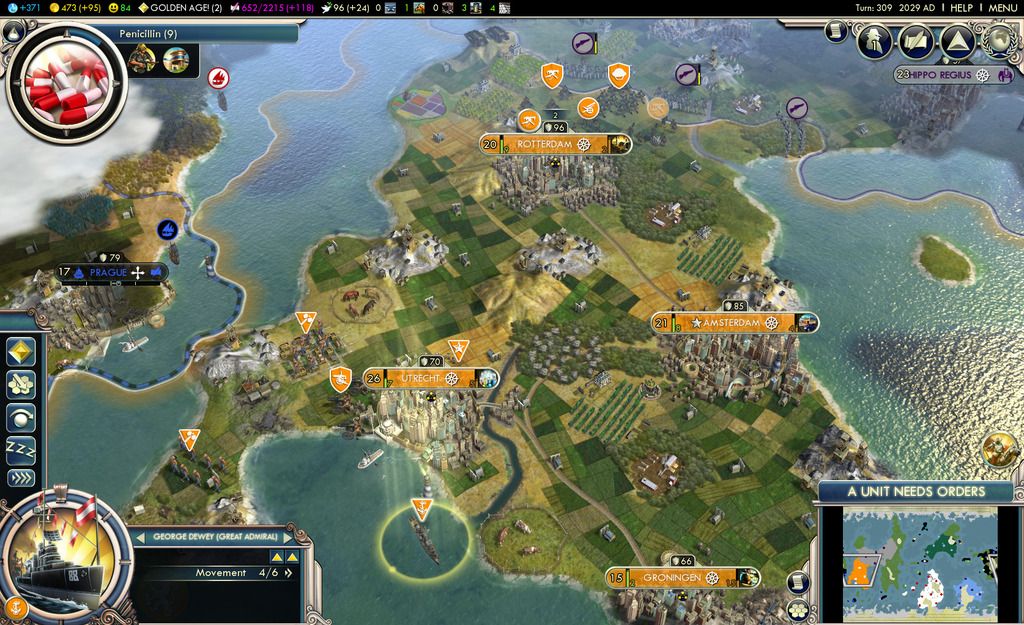
Many of the artists working on Thrive seem to take their inspiration from Civilization V, but I think that's a mistake. CiV was far and away the best-selling installment of the franchise, but that doesn't make it the best game. Here's a (modded) example of Civ IV's GUI:  And here is CiV's:  Which one is more thematic and appealing to casual players? And which one conveys needed information more effectively? |
|
|
|
Post by crodnu on Feb 15, 2017 1:02:23 GMT
They both look like they give mostly the exact same information (civ4 being a little more specific on Great Persons, and having the other civs information being the most relevant differences). Plus it's a little bit unfair to compare MODDED civ 4 to vanilla civ 5, modded civ 4 wouldn't have the great person information for example.
Also, Jewish Reich Facepalm xD
|
|
|
|
Post by Mouthwash on Feb 15, 2017 1:21:51 GMT
They both look like they give mostly the exact same information (civ4 being a little more specific on Great Persons, and having the other civs information being the most relevant differences). CiV has a *drop-down list* for when you want to contact a civ and it shows their attitude and score (whereas Civ IV actually shows changes in score, how far along they are with their research, what religion they are, whether you have open borders or not, whether you have a peace treaty, who is a vassal of whom, and other things BEFORE YOUR EYES). In CiV tech progress is much harder to see, the diplomacy screens take you completely out of the game, and let's not even start on the advisors. I couldn't find CiV mods that substantially improve the GUI and the Civ IV interface improvements are so ubiquitous that almost nobody plays in the Civ community without them these days. Besides, I wanted to show what a proper GUI was like. I thought it would be appreciated! |
|
|
|
Post by tadtiger13 on Feb 15, 2017 6:33:34 GMT
Then you didn't look very hard, the first google search result for "civ 5 ui mod" brings you to EUI, a major improvement over the default Civ V UI. EUI provides a good deal more information than vanilla Civ 5, including a leaderboard on par with modded Civ IV's. EUI gives more information than Civ IV despite being for a slightly less complicated game, especially with regards to cities (before even entering the city screen). EUI's science, resource, golden age, and Great Person displays are definitely superior in information and readability compared to Civ IV.
The only area where I'd give Civ IV the edge is leader screens; not being able to see the map while dealing with AI is annoying, especially when considering deals that exchange cities and you don't know where they are.
|
|
|
|
Post by Mouthwash on Feb 15, 2017 8:50:41 GMT
Then you didn't look very hard, the first google search result for "civ 5 ui mod" brings you to EUI, a major improvement over the default Civ V UI. I will concede that, yes.  But like I said, I had other reasons for wanting to show an ideal GUI.  No game I've ever played has even approached Civ IV's leaderboard in terms of quality (and in my opinion, Thrive's compound bars don't need to be much different). Here's EUI's. It shows a small picture of each leader with their civilization's insignia on it, and next to that is their score in white text (which easily blends in to clouds and ice). All in all, a perfect example of art over functionality. The only thing you can defend are the resource icons next to the Moroccan leader, which I assume are the ones you're currently trading with him. I'm assuming that the science and great person displays are off in the upper-left corner? You're off your rocker if you think those are more readable than the ones in Civ IV. Besides, I think that part of the problem is the art design- big, clunky, stylized. It's fun to look at but it really can't do heavy lifting. Keep in mind that Thrive is an extremely complex game and is real-time, making the GUI much more important for gameplay. |
|
|
|
Post by Oliveriver on Feb 15, 2017 18:14:37 GMT
You have valid points. But from now on I have no opinion on the GUI because my work on it is done. Next time it needs updating, someone else is doing it.
|
|
|
|
Post by Mouthwash on Feb 15, 2017 19:50:22 GMT
Out of curiosity, what skills would I have to learn to make a GUI for Thrive?
|
|
|
|
Post by Oliveriver on Feb 15, 2017 21:40:23 GMT
Graphic design, XML and Lua scripting. We have a tutorial here which roughly guides you through adding GUI content to the game, but as I found, there are countless annoying bits off to the side you have to learn to work with for everything to function correctly. Plus, if you're not well versed in graphic design in the first place you can't exactly get anywhere. |
|
|
|
Post by ATP Kraken on Feb 16, 2017 22:52:43 GMT
One issue EUI has is information overload. There are too many little bits.
cIV similarly uses things much too small, but at least it's manageable. Perhaps Thrive will embrace a GUI large enough to convey information, yet small enough to fit more information.
Alternatively, everything can be hidden and extended with a simple system of windows or tabs.
|
|

