|
|
Post by mitobox on Apr 9, 2017 18:27:14 GMT
Just noticed the new forum layout. I'm digging it (people still say that, right?).
Reminds me of the old forum; WAY more Thrive-centric than the layout this forum had before.
EDIT: Now the foreground changed from white to dark gray. Maybe we should have changes here be reflected on the community wiki (for the sake of cohesion)?
|
|
|
|
Post by Aquos on Apr 9, 2017 18:36:13 GMT
Honestly, I don't like it. I prefer the old design. It was cleaner, and it was easier to find stuff.
|
|
|
|
Post by Immortal_Dragon on Apr 9, 2017 18:37:15 GMT
I could get used to this in all honesty. Either layout is fine with me if a decision were to be made.
|
|
|
|
Post by evolution4weαk on Apr 9, 2017 18:41:16 GMT
I like the old layout more
|
|
|
|
Post by Aquos on Apr 9, 2017 18:55:49 GMT
I like this better. Though I still prefer clinical white. I'm also not a big fan of the double bars :/
|
|
|
|
Post by evolution4weαk on Apr 9, 2017 19:14:19 GMT
Maybe We Can Make 2 Themes This One And The Other One
|
|
|
|
Post by Aquos on Apr 9, 2017 19:15:31 GMT
The other one?
|
|
|
|
Post by evolution4weαk on Apr 9, 2017 19:17:08 GMT
The Dark One The One You Did not Like
|
|
|
|
Post by evolution4weαk on Apr 9, 2017 19:18:21 GMT
 you can change the theme |
|
|
|
Post by Aquos on Apr 9, 2017 19:19:15 GMT
Yeah, that's probably a good alternative.
|
|
|
|
Post by evolution4weαk on Apr 9, 2017 19:50:35 GMT
What Happen!
|
|
|
|
Post by mitobox on Apr 9, 2017 19:52:35 GMT
I think we've seen three variants so far: 1. Original: White. 2. Galactic: Black, like the old forum's own original layout. 3. Planetary: Blue, like the old forum's current layout. This is the one we have right now. |
|
|
|
Post by Narotiza on Apr 9, 2017 19:54:16 GMT
The old forum was green, though, wasn't it?
Anyway I'm helping set up these themes so feedback would definitely be appreciated.
|
|
|
|
Post by serialkiller🌴 on Apr 9, 2017 19:55:37 GMT
The light blue top of the screen on mobile doesn't look good . It should be darker
|
|
|
|
Post by Aquos on Apr 9, 2017 19:56:03 GMT
I think we should be able to choose between blue and white. Because there are people who like both of them.
|
|
|
|
Post by Oliveriver on Apr 9, 2017 19:57:29 GMT
I accidentally ate up my entire afternoon adding two feeds to the website home page and changing the forum layout/colour scheme. It started as an attempt to standardise the header links across the website, dev forum and here, but ended up more extensive. Narotiza and Atrox also helped. I'm still not sure about it. I wasn't sure about the old colour scheme either, but the perfectionist in me wanted to try something different. We still have the old colour scheme saved, but for now, tell us what you think and if you have any alternative suggestions. |
|
|
|
Post by evolution4weαk on Apr 9, 2017 20:27:35 GMT
Why is it so cramped?
|
|
|
|
Post by Narotiza on Apr 9, 2017 20:29:07 GMT
We lowered the width of the forum from 80% to 65%, so there's more room for the 'background' on either side.
Of course, we don't really have much of a background yet...
|
|
|
|
Post by evolution4weαk on Apr 9, 2017 20:32:44 GMT
We lowered the width of the forum from 80% to 65%, so there's more room for the 'background' on either side. Of course, we don't really have much of a background yet... oh ok was wondering if it just me |
|
|
|
Post by mitobox on Apr 9, 2017 20:34:09 GMT
I'm still not sure about it. I wasn't sure about the old colour scheme either, but the perfectionist in me wanted to try something different. We still have the old colour scheme saved, but for now, tell us what you think and if you have any alternative suggestions. Since the short-lived second layout had the Thrive galaxy image set as its background, would it be possible to use the website's planet background for the same purpose? 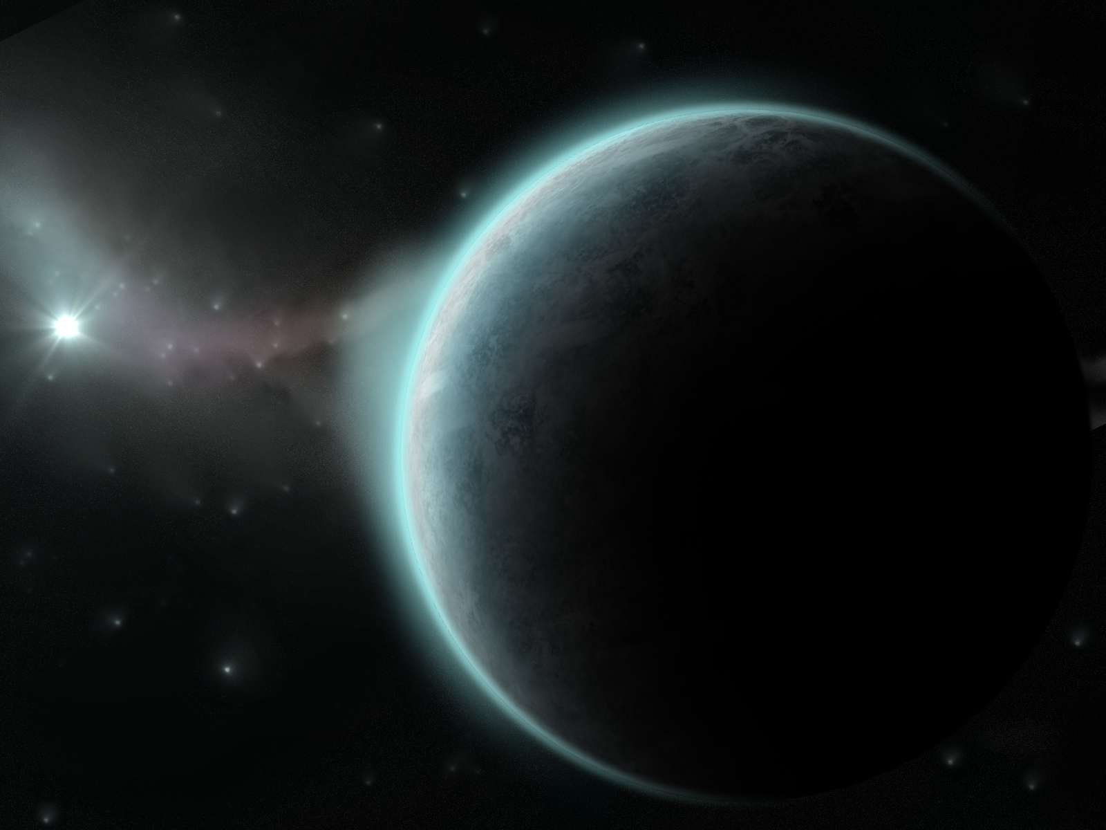 I'd also suggest that image with the blue fog and really big rock spires, but I can't seem to find it. |
|


