|
|
Post by Mouthwash on Sept 17, 2016 12:50:31 GMT
I wonder if civilizations would be generated like this: link (at least on some aspects...) The religion editor is pretty awesome too. Right now, we're thinking that much of 'culture' would be very abstract -- just a value that we use to compare different cultures to see how similar they are. We could use this for things like politeness standards and material culture, but there are also factors of culture which have more wide effects, and I'm not sure how we'd handle those. Perhaps we'd have parts of the culture code map to various different toggles on civilization behaviour/structure. Why not use an ethos system, like Stellaris? Theirs seems almost perfect for a game like this. |
|
|
|
Post by Mouthwash on Sept 17, 2016 10:05:34 GMT
Nature's Revolt: Have a Society Center be overrun by a nonsapient species.
Alexander's Dream: Unite the world by conquest before anyone discovers a gunpowder-based/explosive weapon.
|
|
|
|
Post by Mouthwash on Sept 17, 2016 8:21:39 GMT
But I got something good for you guys. Propably the most retarded fearmongering campaign in the history of conspiracy theories. I'm talking about morgellons. And the amount of detailed information about it is just great. In short: Morgellons is a (fake) disease only found in the USA that causes sores to develop on the victims skin. But wait! People with "Morgellons disease" claim strange coloured fibers grow from these wounds! What could these fibers be? Some debris and dust gathering up in the wounds that you are constantly scratching? No. Never! It's the government! And they are spraying chemtrails containing nanobots that enter your body, assemble in fibers and other structures and then hurt you. People that believe in this conspiracy have claimed they have found the NASA logo on the fibers. Proving they are from the government. I swear to god, I'm not making this up. Look at this (and especially the pictures): chemtrailsplanet.net/2015/08/09/nasa-logo-embedded-in-morgellons-fibers-as-artificial-bio-intelligence/Of course doctors always quickly figure out the "fibers" are just cotton or from a petrochemical origin, like nylon. They end up in the little wounds on the skin of people with "Morgellons" because they have no chance to heal, thus giving the impression that the fibers cause the wounds. Some doctors have even found nerve endings in the "Morgellons samples". Suggesting that these people have been digging almost centimeters into their skin thinking they are finding the "roots" of the fibers. And the wounds are most commonly found on the arms and legs, the only places where people can continuously scratch themselves. TL:DR These people are delusional and actually suffering pain because of it. Morgellons sufferers often have real undiagnosed skin conditions that doctors ignore if they can't find an external cause. If you were itching constantly for no apparent reason, you might also draw a line between that and any unexplained phenomenon in your skin. That's not mental illness any more than pareidolia is. |
|
|
|
Post by Mouthwash on Sept 17, 2016 8:01:38 GMT
I hate to be the 'bad guy' here, but why is this a subforum of its own and not a sticky in Not Thrive?
|
|
|
|
Post by Mouthwash on Sept 10, 2016 3:05:15 GMT
Dang, that looks super creepy. I like the description as well. -edit- Okay here is Microbe through Creature (minus my starting one) 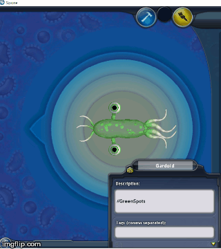 -edit- I've decided for Tribal mode, that I can add/replace 1 piece for each tribe I "take over" plus 1 to start with. That's a pretty rockin cell. |
|
|
|
Post by Mouthwash on Sept 9, 2016 21:48:10 GMT
There's a such thing as taking a joke too far.
But not with this one. Keep it up!
|
|
|
|
Post by Mouthwash on Sept 9, 2016 21:33:51 GMT
Well the way it works is that you can choose which compounds can be seen at all times in the bottom bar via the dropup menu. Ah, that makes perfect sense but somehow didn't occur to me. |
|
|
|
Post by Mouthwash on Sept 9, 2016 19:51:53 GMT
My biggest gripe with it is that ATP is represented in green, and green should always be health. That's universal. I assume that health is now represented by the white bar above the compounds, which is bad. Bars like that simply don't catch the eye; it needs to be the twin to the ATP bar. And finally, the numbers (and their denominators) need to be equal in size and placed in the center of their bars. Other than that, I don't see any problems. ATP is health (or will be once the new health mechanics are implemented). The white bar is a scrollbar for the lower list of compounds. Anyway, I made a compromise design. Feel free to pick that apart too since you seem to enjoy that. I'm sorry! I wasn't trying to bring you down, I just want it to work well. I think that your compromise is perfect and I would welcome it being in the finished game. The only nit I have to pick is that compounds represented on the 'dropup' bar to the right are redundant if they're also on the bottom, and they take space away from those that aren't (amino acids, ammonia, carbon dioxide). Or does the bottom also have those listed, since it has a scrollbar? |
|
|
|
Post by Mouthwash on Sept 9, 2016 5:42:26 GMT
In all seriousness though, I have made a poll on the development forum a couple hours ago, so we'll see where that takes us. I did advocate this to be a poll for everybody.  I won't be... but it's not quite so bad as I feared. I like that the 'combination' option is winning. There's always going to be somebody who won't figure that out. I think it should just be smaller. My biggest gripe with it is that ATP is represented in green, and green should always be health. That's universal. I assume that health is now represented by the white bar above the compounds, which is bad. Bars like that simply don't catch the eye; it needs to be the twin to the ATP bar. And finally, the numbers (and their denominators) need to be equal in size and placed in the center of their bars. Other than that, I don't see any problems. |
|
|
|
Post by Mouthwash on Sept 9, 2016 5:23:11 GMT
3. The font was changed everywhere there was a paragraph or a long text to read. The Thrive font was left as a label on buttons and the like because it looks better. You're right! I was looking at those and must have assumed you didn't change it at all. Personally, it doesn't look better to me, but that's something I can live with. You sure you're using 0.3.2? I'll make a video. EDIT: How exactly is the game usually recorded? After it opens, the recording just shows my cursor and blackness. EDIT2: You can see in this video: |
|
|
|
Post by Mouthwash on Sept 9, 2016 1:55:50 GMT
2. We want strafing for some reason. I agree that point-and-click would be more intuitive and easier to get into the flow with, though; I don't think anyone's thought to reconsider wasd and bring up such an idea before though. You could even leave both in. Spore does. I'm reminded every time I open the game.  It's absolutely the case. I created a cell as wide and long as the editor would allow, to make sure I was right. |
|
|
|
Post by Mouthwash on Sept 9, 2016 1:47:15 GMT
Pics or it didn't happen  You honestly deserve an award for this. |
|
|
|
Post by Mouthwash on Sept 9, 2016 0:09:37 GMT
1. Why can't we zoom out more? This can't be a technical limitation. One of the devs compared the behavior of predator AI in the game to Slenderman, but it's kinda pointless if having the slightest advantage in speed is enough to vanish any pursuer within seconds. My response will rely on an old and therefore likely incorrect memory, but I believe I read that this has to do with how cells currently spawn. There is a polygon around the player that demarks location where cells enter into existence and leave it. I imagine the zoom cap is probably to preserve immersion, as otherwise the player would see a large dead space where no cell exists, and any who enter there surely vanish from the face of the mundus the game and from whence conjured cells come. But again, I can't guarantee that that is the complete/only reason. Yeah, I know that. But why not expand the size of the spawn area? It's quite ridiculously tiny in 0.3.2. |
|
|
|
Post by Mouthwash on Sept 9, 2016 0:05:10 GMT
I don't even count the fourth ability when I play. I just pretend it isn't there.  |
|
|
|
Post by Mouthwash on Sept 8, 2016 23:50:21 GMT
1. Why can't we zoom out more? This can't be a technical limitation. One of the devs compared the behavior of predator AI in the game to Slenderman, but it's kinda pointless if having the slightest advantage in speed is enough to vanish any pursuer within seconds. 2. I really think that pressing the mouse button should be enough to make the cell move. This worked just fine in Spore. Why are we forced to use both the mouse and the keyboard? 3. I recall a conversation a while back where the devs talked about replacing the current blocky text in the tutorial and GUI. Why did nothing come of this? It's clearly not the best font. 4. Why is the nucleus, not the cell wall, responsible for absorbing compounds? As it is, a cell's size doesn't affect its ability to gather resources. Maybe this just hasn't been implemented yet, but I thought I'd bring it up, just in case. 5. The soundtrack is done completely wrong. I mean, from the composer's perspective, the cell/microbe stage is the least interesting and the simplest, so perhaps they think it ought to go with serene or ocean-themed music. But from the player's perspective, they're kicking off an epic journey. There's nothing more downing than for this to be greeted with a dull ambience (I'm referring here to editor themes 1 and 5, and all of the normal themes). This is made even worse by the fact that the microbe stage really is the least interesting and simplest. It needs music to carry it, much more than the other stages. By comparison, listen to Spore's cell stage soundtrack. Immediately after exiting the meteor, the first thing you hear is a peppy, exciting tune, like you're exploring a jungle. Who wouldn't want to play a game that greeted you like that? As the cell grows in scale, the music tones down, eventually reaching an oceanic ambience by level six. It stays this way until level nine, when it launches into an even more active version of the first soundtrack. This is because you've grown enough to see a sandy seabed in the background, and you apparently are progressing to become a large-scale creature. The game wants you to be excited about your progress! Once you reach enough points to move on to creature stage, the ambience returns, since there isn't much more to do. Finally, as well as replacing the dull soundtracks, I think that there is absolutely no reason to use more than one for the editor. It's how Pavlovian conditioning works: a single memorable tune is enough to set the brain into 'microbe editor mode,' but this is less effective with multiple triggers. In my opinion, the current editor theme 4 is the best fit (also because it doesn't work well as a gameplay track). |
|
|
|
Post by Mouthwash on Sept 8, 2016 22:23:11 GMT
If something like that does happen, I would recommend everyone read this first, because it covers all the problems with the current GUI and some attempts at responses to them. The criticism is nuts: "i clicked the x expecting menu but i closed the game. Honestly its a good thing its there because it saved my valuable time from being wasted at looking at the horrid GUI."I've never once had this problem, seeing as there is a button saying "main menu" right beside it. You can add some mouseover text to tell players what it does anyway. "The icons are ridiculous. I dont know how many times i clicked something not knowing with confidence what will happen. Unless thats the effect you want it for."
There are five icons during gameplay. One is the reproduction button, which is pretty hard to mistake. Another is the main submenu button in the bottom left, which is admittedly (but fixably) misleading. The other three are on the submenu: the save button, which has a big floppy disk on it (the universal symbol for 'save'), the help button, which has a question mark, and the load button, which is intuitively underneath the save button. The nonfunctional icons (options and statistics) have a gear and a bar graph, respectively. I couldn't get confused if I tried. "The main issue for me is specifically the compounds tab. The left and right edges are so spacious it's kind of annoying to have up, especially if you want to keep constant tabs on your compound levels."
This is no longer the case. That's certainly an opinion. It's not a good opinion as far as I'm concerned, but it's an opinion. Which can't be found anywhere on the internet and/or costs a lot of money? Whose files can't be transferred to any other program? The suicide button should be tiny and placed up somewhere around the upper-right menu button. Are people going to be suiciding in every game? I thought it was a fallback mechanism. Use it where the big compound counters are displayed right now. The reproduction button is certainly big enough to handle that. I do agree that the editor is terrible, but it would be acceptable at this stage if things were made a bit more transparent. Ripping apart? These all seem like incredibly straightforward things to add, unless I'm completely misunderstanding what you mean by 'processes screen' or 'reproduction progress.' 1366x768, which is by far the most common size. About 70% of people will have a comparable or larger screen. Besides, we can cut some buttons for smaller screens, and put them in a dropdown list instead. Virgil hated the Aeneid, Arthur Conan Doyle hated Sherlock Holmes, and John Conway hates the Game of Life. Artists don't have to like their creations for the rest of us to. Would you be swayed by an overwhelming poll result in favor of keeping it? I don't see a reason that the current UI couldn't be replicated in a more common program, even without your files. It's a pretty simple design. |
|
|
|
Post by Mouthwash on Sept 8, 2016 18:32:43 GMT
Hey now, suggestions don't have to be backed by action, it just so happens that a few people who've made suggestions did so with a bit of modding or a mockup to show what they meant. Helpful, not necessary. Well, my own ideas are mainly about changing the location of certain things, or removing annoyances. It shouldn't really look different from the current GUI. It's better to trust the fans on this. Building a game and playing one require two different states of mind, and what works for one might not work for the other. I think it should be settled by poll: concept art of a new GUI vs the one we have now. |
|
|
|
Post by Mouthwash on Sept 8, 2016 12:24:54 GMT
I just recalled that tribal stage clothing gives bonuses. I think it would violate the spirit of the challenge to use the outfitter, wouldn't it? Completely agree. That's why I'm so stuck. It's really hard to divide your small population village into groups that will give gifts to appease the other villages to buy you time to harvest more food to give gifts to buy you time to harvest more food WITHOUT any harvesting clothing. On top of that you need to somehow take a moment to move your entire village across the continent to fully ally with one of the villages WITHOUT any social clothing. Destroying other villages is absolutely out of the question because you have no offensive power whatsoever. So far I've befriended two villages. If it's on hard than it's actually impossible to befriend the last village without the social bonus. |
|
|
|
Post by Mouthwash on Sept 8, 2016 11:56:26 GMT
The idea of defining them as an entity apart from the game seems a little pointless, though. Everything they've ever produced is for Thrive, and I don't see why they would even be together otherwise. I suggest that the name just be used in the main cutscene, perhaps beside the logo?
|
|
|
|
Post by Mouthwash on Sept 8, 2016 11:19:46 GMT
I don't understand the need for this. Revolutionary Games doesn't need donations or investment, and it isn't working on anything besides Thrive. The term itself is just a label for the team.
|
|


