|
|
Post by Mouthwash on Feb 22, 2017 12:55:36 GMT
Have fun here, this community is pretty cool.
|
|
|
|
Post by Mouthwash on Feb 22, 2017 12:52:11 GMT
Erm, is this from Warlight or something? The map looks familiar.
|
|
|
|
Post by Mouthwash on Feb 22, 2017 12:48:36 GMT
I think I've made my point in the release thread, but I also want to say that I think that stuff like graphics or performance enhancements really need to be put on the backburner in favor of mechanics. The game isn't even a proof-of-concept for microbe stage yet.
|
|
|
|
Post by Mouthwash on Feb 18, 2017 6:22:06 GMT
Three more issues:
1. Are the compound quantities rounded from more precise numbers? When a player sees their cell absorbing oxygen, no matter how little, he should expect his oxygen level to rise.
2. Amino acids play zero role in the game right now, and I've never seen the AA bar rise at all. Even if there will eventually be a good reason for them, they needn't have been included in this release.
3. The ingame music is way too soft compared to the menu's.
|
|
|
|
Post by Mouthwash on Feb 15, 2017 23:58:27 GMT
I felt my condescending Beethoven profile picture was too confrontational, which is why I'm now Gustav Mahler. Not so iconic perhaps, but a bit more pleasant. This is a great avatar but Beethoven was like your brand, man. |
|
|
|
Post by Mouthwash on Feb 15, 2017 19:50:22 GMT
Out of curiosity, what skills would I have to learn to make a GUI for Thrive?
|
|
|
|
Post by Mouthwash on Feb 15, 2017 8:50:41 GMT
Then you didn't look very hard, the first google search result for "civ 5 ui mod" brings you to EUI, a major improvement over the default Civ V UI. I will concede that, yes.  But like I said, I had other reasons for wanting to show an ideal GUI.  No game I've ever played has even approached Civ IV's leaderboard in terms of quality (and in my opinion, Thrive's compound bars don't need to be much different). Here's EUI's. It shows a small picture of each leader with their civilization's insignia on it, and next to that is their score in white text (which easily blends in to clouds and ice). All in all, a perfect example of art over functionality. The only thing you can defend are the resource icons next to the Moroccan leader, which I assume are the ones you're currently trading with him. I'm assuming that the science and great person displays are off in the upper-left corner? You're off your rocker if you think those are more readable than the ones in Civ IV. Besides, I think that part of the problem is the art design- big, clunky, stylized. It's fun to look at but it really can't do heavy lifting. Keep in mind that Thrive is an extremely complex game and is real-time, making the GUI much more important for gameplay. |
|
|
|
Post by Mouthwash on Feb 15, 2017 6:07:16 GMT
You just press it to enter engulfing mode. You should experience some speed decrease in that mode. You do need to be bigger than other cells to eat them, and they can try to eat you if they're bigger than you. I used cytoplasm to get as big as possible and it worked. Personally, I think some notification on the screen rather than a graphical change on the cell itself would work better. |
|
|
|
Post by Mouthwash on Feb 15, 2017 3:14:46 GMT
Engulfment is still a thing, it's just that the cell doesn't change colours anymore due to graphical glitches. I don't know if pressing G one time puts you in 'engulfing mode' or whether you have to keep it pressed but neither one works for me. Do you have to be substantially bigger than your prey for it to work? |
|
|
|
Post by Mouthwash on Feb 15, 2017 1:31:33 GMT
Well, your language is quite harsh, Mouthwash, but I have to agree with many of your points. However, I welcome organelle division. Even though protozoa aren't all time undergoing binary fission, when they do organelles divide, and as reproduction is your main goal in the phase, I would say it would be boring to be doing other things as a player. I suppose it depends on how heavily the customization aspect is emphasized in microbe stage. If it's just a prelude game to set you up on the planet than I'll concede cell division doesn't matter that much... but I still think it goes against the most basic element of gameplay: that you design your own creature. |
|
|
|
Post by Mouthwash on Feb 15, 2017 1:21:51 GMT
They both look like they give mostly the exact same information (civ4 being a little more specific on Great Persons, and having the other civs information being the most relevant differences). CiV has a *drop-down list* for when you want to contact a civ and it shows their attitude and score (whereas Civ IV actually shows changes in score, how far along they are with their research, what religion they are, whether you have open borders or not, whether you have a peace treaty, who is a vassal of whom, and other things BEFORE YOUR EYES). In CiV tech progress is much harder to see, the diplomacy screens take you completely out of the game, and let's not even start on the advisors. I couldn't find CiV mods that substantially improve the GUI and the Civ IV interface improvements are so ubiquitous that almost nobody plays in the Civ community without them these days. Besides, I wanted to show what a proper GUI was like. I thought it would be appreciated! |
|
|
|
Post by Mouthwash on Feb 15, 2017 0:29:15 GMT
Many of the artists working on Thrive seem to take their inspiration from Civilization V, but I think that's a mistake. CiV was far and away the best-selling installment of the franchise, but that doesn't make it the best game. Here's a (modded) example of Civ IV's GUI: 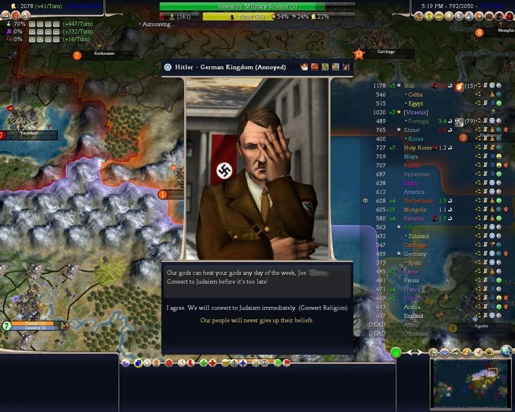 And here is CiV's: 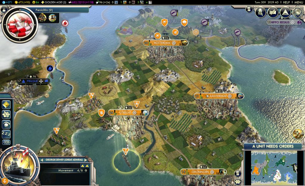 Which one is more thematic and appealing to casual players? And which one conveys needed information more effectively? |
|
|
|
Post by Mouthwash on Feb 14, 2017 23:50:28 GMT
Thoughts/complaints:
1. The health bar looked awful to my eyes when I first saw it, but I have to admit that it works very well when actually playing the game. I don't have any trouble focusing on it (at least outside of the darker environments; it does need to be made lighter).
2. Organelle division is a completely unneeded and unwelcome mechanic. It totally ruins the point of designing your own cell, and it isn't even realistic since AFAIK protists don't spend most of their lives undergoing binary fission (much less swimming around and dodging predators). Why not just have the player collect a certain amount of compounds and then begin the process (i.e. fade to the editor)?
3. I have encountered CTDs both with and without admin privileges. However, they are much less frequent with privileges enabled, so I assume there is a separate cause for them.
4. The oxytoxy bar seems pointless since toxins can be generated directly from oxygen.
5. Toxins are generated much too far away from the cells and don't have any correlation to where their toxin vacuoles are actually located. This makes evading danger much more frustrating and arbitrary. 'Surprise toxin in the face' really isn't all that fun.
6. Engulfing appears to have been removed from the game, so why not remove it from the instructions as well?
7. The GUI does not hold up well. The list of bars is extremely intrusive and the numbers are placed too far to the right of the screen, making them hard to see at a glance. You see that ATP measure beside the health bar? That's where they all should be, and color-coded as well.
8. The absolute worst issue with the game is that there is zero transparency. I can't tell what anything does anymore. Most of the time my ATP is caught at a certain threshold, but oxygen, glucose and ammonia don't seem to go down when I swim. What causes health to regenerate? What do organelles DO? What causes you to divide (it certainly isn't what the tutorial claims)? Here are the three main issues:
(A) Health only appears to go up when I collect either ammonia or glucose, regardless of how much I already have of those. It doesn't do so consistently- it's either one or the other, and nothing tells me what circumstances change this. However, occasionally my health shoots back up the instant I get damaged, presumably using a stored compound. Why not just make health go up according to a fixed rate of conversion?
(B) Most of the time my ATP is caught in the early teens, flipping back and forth between two numbers. I originally assumed that glucose was being converted to ATP only when a certain threshold was met and so that canceled out the consumption, but this is not true. I've looked at my compounds and none of them change in the slightest while this is happening. The only thing that lets me accumulate ATP is reaching a certain amount of mitochondria or vacuoles (don't know which) and then I can easily get into the hundreds and never fear starvation again. How can this possibly be deliberately coded in? The only sensible thing to do, like health, is to convert glucose to ATP at a fixed rate according to how many mitochondria you have.
(C) Cell division does seem correlated with glucose and ammonia, but it only seems to happen when I actually collect those compounds and doesn't care about what I already have. Also, I can see that organelles grow larger before dividing, but what does it mean when the nucleus grows?
Conclusion: This is a very bad release. I don't understand the team's claims of being ready for more outreach. Whatever improvements there are in 3.3, the gameplay itself has regressed substantially and is certainly not presentable to a critical audience. The most frustrating thing here is that most of these problems are easily fixable and sometimes (in the case of the GUI) required more work to have reached this state than they would have to be done properly.
|
|
|
|
Post by Mouthwash on Feb 2, 2017 21:37:09 GMT
I'll concede it's difficult to focus on both, but in future the health bar will flash red whenever taking damage so the issue might be reduced a little. Where would you suggest the health bar and compound bars go, considering moving themwould involve displacing other buttons My personal idea? A big green bar on the bottom toolbar, twice as thick and 50% longer than the current bar, which shrinks at both ends when you take damage. If you're looking to save on space, a clock-like wheel that depletes in a circle. Should there be a bar in the editor, though? Bars convey information quickly during gameplay but they just don't seem like a necessary feature outside of it. I think that if plain bars are good enough for Skyrim, then they are good enough for Thrive... but if you're determined to have something else, then maybe you could just fade the DNA pattern a bit so the shades of green don't clash so much. I genuinely couldn't think of a better way. My writing is blunt and doesn't lend itself to diplomatic phrasing (maybe that's a consequence of all my years of debating at Civfanatics). |
|
|
|
Post by Mouthwash on Jan 31, 2017 8:24:08 GMT
The most significant changes in this update are the new health and reproductin system, random microbe generation (the first step towards auto-evo) and random species name. What is the new health and reproduction system? Is there a description posted anywhere? |
|
|
|
Post by Mouthwash on Jan 31, 2017 8:18:56 GMT
It's been a long while since I was on here and I don't remember what I said last time about the GUI. So I'll just give my immediate impressions as a player: I have no problems with how this looks; it creates the atmosphere perfectly while remaining completely unintrusive. Regardless, there are some genuinely puzzling decisions in terms of how it presents information. The health bar is all the way at the opposite corner of the screen from the other bars, which makes it difficult to focus on them both (plus that DNA coloring is really off-putting and the numbers on all bars need to be bolded at the very least). Also, what is that tiny ATP tracker doing right down there by the menu button? I don't understand why you think that things as basic as health and energy shouldn't be right beside each other. Look at how Skyrim does it- they don't have numbers but you can't help but look at them. There's also a tremendous value in color-coding things to help players create an association. Look at your cell editor. It's just so uninteresting to someone who doesn't already know what roles mitochondria or vacuoles play in the game. I think that could be solved by shading their buttons different colors (green means health, purple means poison, blue means speed, etc.) as well as separating their costs and names by either color or font so they catch the eye better. I'd also love to eventually see a drop-down description of what each one does when you hover over them. Finally, your tutorial popups are kinda hard to read given that they are white text on a light blue background and the environment is light blue with white bubbles. Spore's tips had black, bolded text on a yellow background and they worked perfectly. Maybe that would hurt your theming, but I still think this could be done better. That's all I have to say. Please don't interpret it as grouchy nitpicking, I have only the best intentions and I think you did a great job overall. |
|
|
|
Post by Mouthwash on Jan 30, 2017 7:59:45 GMT
It doesn't allow you to go into reproduction mode when it says you can (in the tutorial). And I'm also experiencing crashes.
I'll try to post something more after playing a bit.
EDIT: Is there a list of changes somewhere? I have no idea what this release actually is.
|
|
|
|
Post by Mouthwash on Jan 30, 2017 7:56:48 GMT
No don't worry that's not the case. It's because we have a private Slack discussion chat where we do far more discussing than on the forums, but more casually.  Why bother having a development forum, then? I thought it was about transparency. |
|
|
|
Post by Mouthwash on Jan 30, 2017 5:47:50 GMT
I thought we were past the 'idea stage.' What are the disagreements about?
|
|
|
|
Post by Mouthwash on Jan 30, 2017 5:25:22 GMT
So. It's been a while. What's happened in the past few months? The dev forum looks deserted; please tell me that doesn't reflect the state of the project.  |
|


